
Make your service menu easier for customers by simplifying labels into 5–6 clear, descriptive items like “Oil Change” and “Tire Rotation” so users find services fast. Optimize for mobile with a compact, collapsible menu and 44×44 px touch targets to reduce mis-taps. Highlight 1–2 primary CTAs with larger, high-contrast styling and repeat them where needed to drive action. Keep testing labels and placements so you’ll see what works and can learn how to improve further.
Key Takeaways
- Limit menu to 5–6 clear, service-focused labels (e.g., Oil Change, Tire Service, Customer Reviews).
- Use a collapsible hamburger menu and keep sub-menu depth shallow for mobile usability.
- Ensure touch targets are at least 44×44 pixels to prevent missed taps on phones.
- Highlight primary CTAs with larger size and high-contrast color, placed at top and repeated.
- Regularly test with analytics and quick usability checks to refine labels and menu structure.
Simplify Menu Structure With Clear, Descriptive Labels
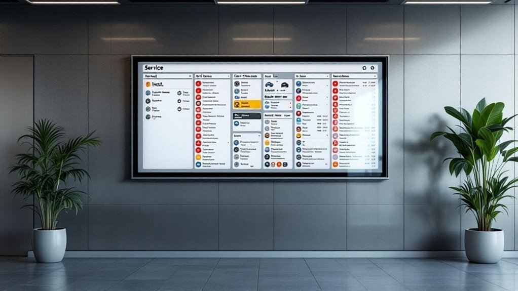
Keep your service menu tight and focused—aim for 5–6 clear, descriptive labels so visitors can spot what they need at a glance. You’ll use intuitive titles like “Oil Change,” “Tire Rotation,” or “Customer Reviews” so people immediately understand options without guessing. Group related subcategories under those headings to reduce clutter and keep essential info one click away, which boosts retention. Don’t assume labels are perfect: rely on user feedback and routine user testing to spot confusion and refine wording. Regular reviews let you adapt labels as behavior shifts, keeping navigation efficient and accessible. The result is a streamlined menu that helps users find services fast and completes tasks with minimal friction.
Prioritize Mobile-Friendly Navigation and Touch Targets
Because about 60% of people visit dealership sites on their phones, you should design navigation that’s compact, easy to tap, and quick to scan—use a collapsible or hamburger menu, keep sub-menu levels shallow, and make buttons at least 44×44 pixels so fingers don’t miss. On mobile you’ll retain more users by prioritizing mobile usability: clear, descriptive titles, minimal choices per screen, and visible affordances for tapping. Guarantee each touch target is spaced to avoid accidental taps and use consistent placement for common actions. Test on multiple devices and orientations to catch layout shifts or tiny targets. Use analytics and quick usability tests to refine labels and menu depth so customers can find services fast without frustration.
Highlight Key Actions With Visual Hierarchy and Strong CTAS
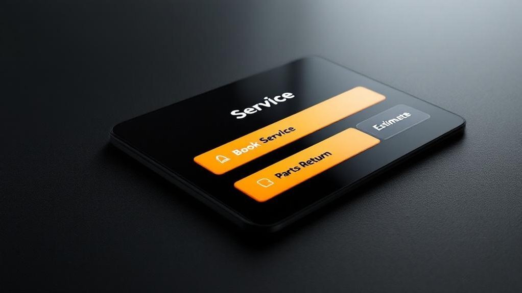
Visual hierarchy helps users spot the most important actions on your service menu quickly, so prioritize and style critical CTAs—like “Book Your Service Now”—with larger sizes, bold type, and high-contrast colors. Place primary CTAs at the top and repeat them strategically through the menu so users encounter opportunities to act as they scan. Use visual contrast to separate primary actions from secondary links; limit CTAs per page to avoid choice overload and improve navigation efficiency. Test placements and styles by reviewing engagement metrics—click-throughs, heatmaps, and conversion rates—and iterate based on results. By emphasizing a clear visual hierarchy and strong CTAs, you’ll boost user engagement and make it obvious what customers should do next.
Frequently Asked Questions
What Is the Most Profitable Department in a Car Dealership?
The service department is the most profitable; you’ll see service profitability drive much of dealership revenue through high‑margin labor, repeat maintenance, and specialized offerings, so prioritize efficient scheduling, upsells, and strong customer follow‑up to maximize returns.
What Is Navigation Menu Optimization?
It’s simplifying your site’s menu layout to boost user experience: you’re reducing choices, organizing clear labels, prioritizing mobile-friendly paths, avoiding deep dropdowns, and iterating with analytics so visitors find essentials quickly and confidently.
How Do Service Customers Increasingly Prefer to Communicate With Dealerships?
You’re increasingly preferring digital communication preferences: most want texts, chats, or messaging apps for instant replies, with email still used; make customer feedback channels easy, offering online scheduling and real-time updates through their preferred platforms.
How to Run a Successful Automotive Service Department?
You might doubt it’s doable, but you can run a successful automotive service department by prioritizing customer satisfaction, boosting service efficiency with streamlined scheduling, ongoing staff training, CRM-driven communication, clear pricing, and consistent quality checks.
Conclusion
You’ve got what it takes to make service menus effortless: clear labels, mobile-first design, and bold CTAs. You might worry it’ll take too long or cost too much, but small, focused changes deliver big gains in customer satisfaction and conversions. Start with one page, test it, and you’ll quickly see visitors staying longer and booking more. Do it now—your customers (and your bottom line) will thank you.