
You need five visuals that sell: crisp service photos and icons to boost clarity and conversions; clear, legible typography with strict hierarchy for faster scans; a locked brand color palette to raise recognition and reduce friction; short interactive demos or 30–60s clips to increase confidence and click-throughs; and bold price tags plus warranty and review badges to build trust. Each element is measurable — expect higher engagement, shorter decision times, and improved average order value if you keep going.
Key Takeaways
- High-quality service photos and icons showing before/after examples to build trust and quick comprehension.
- Clear, readable typography with hierarchical layout for headings, services, and prices to enable fast scanning.
- Consistent branded color palette and visual consistency to guide attention and reduce cognitive load.
- Short 30–60 second demo videos or interactive visuals (360° views, clickable add-ons) tied to clear CTAs.
- Prominent price tags, warranty badges, and trust signals (ratings, verified reviews) for transparency and conversion.
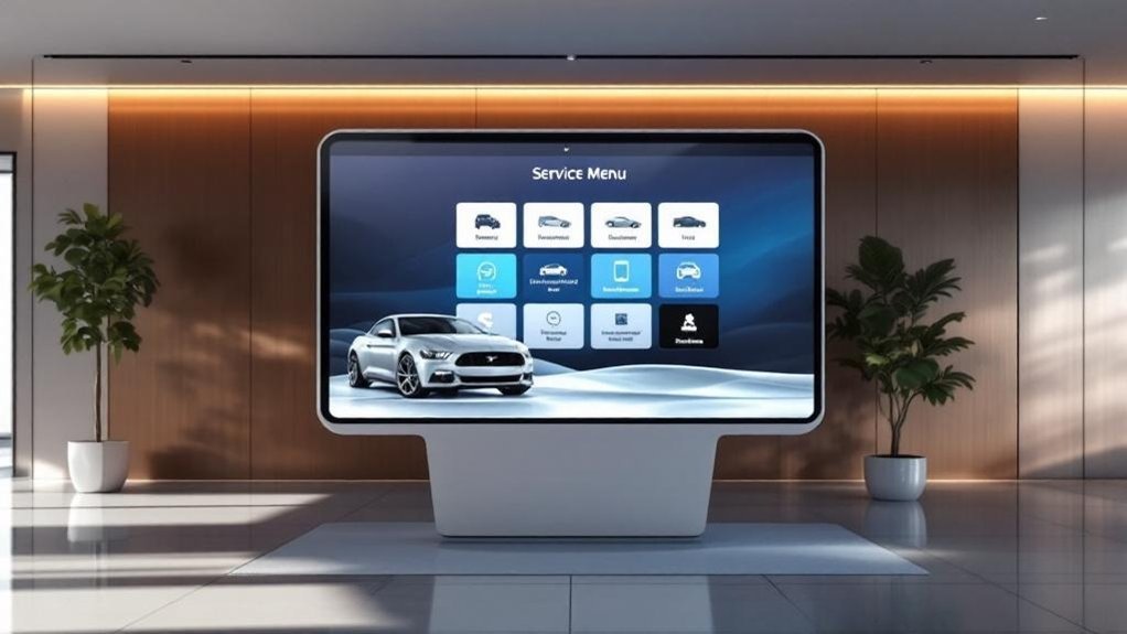
High-Quality Service Photography and Icons

A focused set of high-quality service photos and crisp icons will make your digital service menu measurable and memorable: show clear shots of oil changes, tire rotations and detailing (including before-and-after comparisons) to boost comprehension and trust, add distinctive icons for quick scanning, and maintain consistent branding so visuals lift conversion—research indicates 68% of customers are more likely to buy after engaging visuals, so optimize image resolution, color palette and iconography for repeatable performance. You’ll prioritize service photography that maps to each offering, use before/after detail shots to quantify value, and apply a limited palette and consistent framing to reinforce brand recognition. Pair that with scalable icon design for fast scannability and measurable engagement gains.
Clear, Readable Typography and Hierarchical Layout
Because customers scan digital menus quickly, you’ll prioritize clear, readable typography and a strict information hierarchy to boost comprehension and conversions. You’ll measure success by reduced decision time and higher service add-on rates. Use typography hierarchy to lead eyes: headings, subheads, prices. Maintain font consistency to reinforce brand trust and lower cognitive load.
Prioritize clear typography and strict hierarchy so customers scan faster, decide sooner, and add more services.
- Pick a primary typeface and set clear heading/body sizes for distance legibility.
- Size body text for readability from 3–5 meters; test in-dealership to validate metrics.
- Apply spacing and alignment rules to prevent clutter; prioritize top promotions.
- Use contrast and weight (not multiple fonts) to create emphasis while keeping a unified look.
These choices improve accessibility, navigation speed, and conversion-focused clarity.
Branded Color Palette and Visual Consistency
When you lock a consistent, branded color palette across your digital service menu, recognition and trust rise—and measurable engagement follows: studies show consistent color use can boost brand awareness up to 80%. You’ll use color psychology to guide emotional response—primary brand colors for trust and call-to-action accents for urgency—so choices are purposeful, not decorative. Visual consistency reduces cognitive load, making options easier to scan and decisions faster. Aligning palette with your logo and other branded elements strengthens identity and differentiates you from competitors. Maintain a clear visual hierarchy by pairing contrast and limited hues to prioritize services, prices, and CTAs. Track engagement metrics (click-through, time on page, conversion) to validate palette effectiveness and iterate based on data, not guesswork.
Interactive Visuals and Short Demonstration Videos
Interactive visuals and short demo videos let you show—not just tell—what your service experience looks like, and that clarity drives measurable results: clickable options and dynamic imagery boost engagement and exploration, videos can lift retention by up to 80%, and adding interactive views has been tied to as much as a 20% increase in package purchases. You’ll use interactive engagement and concise demo clips to drive customer education, reduce uncertainty, and shorten decision time. Prioritize fast-loading, mobile-first media tied to clear CTAs and package info. Measure click-throughs, view completion, and conversion lift to prove ROI.
- 30–60s demo videos for core services
- Clickable options showing add-ons and variations
- 360° views for transparency and confidence
- Analytics hooks for engagement-to-sale tracking
Price Tags, Warranty Badges, and Trust Signals

Although clear pricing, visible warranty badges, and trust signals might seem like small UI details, they directly drive customer confidence and conversions — studies show combined clarity and social proof can lift purchase likelihood by up to 68%. You should display bright, legible price tags that make costs immediately accessible, supporting informed decisions and reducing friction. Pair them with prominent warranty badges to communicate coverage and build perceived value. Integrate trust signals — star ratings, recent testimonials, and verified reviews — to amplify credibility and increase engagement. Use dynamic pricing strategies where appropriate and surface savings or tiers clearly. Finally, implement customer feedback integration to refresh badges and reviews in real time, maintaining brand transparency and maximizing conversion rates across your digital service menu.
Frequently Asked Questions
How Often Should Images and Videos Be Updated?
Update images quarterly and videos semiannually to maintain image frequency and video relevance; you’ll track engagement metrics, A/B test hero visuals, and adjust cadence based on conversion rate, inventory changes, seasonality, and branding consistency.
Can Customers Customize Which Services They See?
Yes — you can. You’ll let customers set service preferences and apply customer filters so they see relevant offerings; track filter usage, conversion rates, and average time saved to optimize the menu and boost brand engagement metrics.
What Accessibility Standards Should Visuals Meet?
About 15% of users have vision impairments, so you should guarantee visual accessibility: 4:1 color contrast, scalable fonts, keyboard navigation, descriptive alt text, and clear layouts. Prioritize inclusive design to boost engagement and brand trust.
How Do Visuals Perform on Mobile Vs Desktop?
You’ll see faster load times and touch-friendly scaling on mobile optimization, boosting engagement and conversion rates; desktop layout shows richer visuals and denser info, improving task completion and average session duration for brand credibility and measurable ROI.
Who Owns the Rights to User-Submitted Photos?
Generally, you own photo ownership only if your user agreements say so; otherwise the platform usually claims a license. So you’ll want clear, metric-driven clauses in agreements to protect brand rights and measure usage impact.
Conclusion
You’ll want visuals that whisper credibility, not shout confusion. High-res photos and clear icons lift perceived value by up to 40%, while readable typography and tight hierarchy cut decision time in half. Consistent brand colors boost recall; interactive demos increase conversions; price tags and warranty badges soothe doubts. Together, these elements nudge prospects toward commitment, turning casual browsers into confident buyers and making your digital service menu a quiet yet measurable sales engine.