Keep your service menu simple and prioritized so customers find common jobs in three taps or less; group related services under clear headings and limit main choices to five or six. Design mobile-first with large tappable areas, fast load times, and minimal scrolling so users don’t get frustrated. Use plain, action-focused labels, a strong visual hierarchy, and bold CTAs placed top-to-bottom for quick booking. Follow these steps and you’ll streamline discovery — keep going to uncover practical implementation tips.
Key Takeaways
- Limit top-level options to 5–6 clear, service-focused items (e.g., Oil Change, Tires, Inspections) for quick scanning.
- Use simple, descriptive labels and group related services under headings to reduce cognitive load.
- Prioritize mobile-first design with large tappable areas and fast-loading, lightweight pages.
- Create bold, contrasting CTAs with action verbs and place them at top, middle, and bottom of the page.
- Regularly review analytics and user feedback to refine menu items and surface the most popular services.
Simplify and Prioritize Your Menu Options
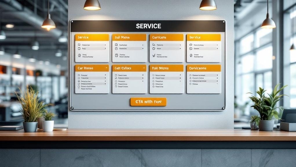
When customers scan your service menu, they’ll appreciate a clear, concise layout—limit the main options to about five or six well-defined choices so people can find what they need fast. You should streamline offerings by using descriptive titles like “Oil Change Services” or “Tire Rotation” so visitors instantly grasp each option. Group related services under relevant headings to reduce clutter and guide attention logically. Regularly review menu items with user feedback to prioritize services that are most requested, removing or consolidating seldom-used entries. Make a visible call-to-action within the menu that prompts booking or inquiries, keeping the path from discovery to action short and obvious. This approach keeps your menu focused, user-friendly, and conversion-ready.
Design for Mobile-First Navigation and Touch
Designing your service menu for mobile-first navigation means prioritizing touch interactions, fast loads, and clear choices so customers can book or get info in a few taps. You’ll want to optimize mobile usability by simplifying choices to 5–6 clear options, avoiding complex drop-downs that frustrate users and search crawlers. Make tappable areas large, keep page weight low, and structure content so critical actions are immediately visible. Empathize with on-the-go visitors who need speed and clarity.
- Reduce options to ease decision-making and calm anxiety.
- Use sizable touch targets so fingers don’t miss and frustration drops.
- Improve load times to keep impatient users engaged.
- Remove dropdowns that hide content and break navigation flow.
Use Clear Labels, Visual Hierarchy, and Strong CTAs
Clarity matters: use simple, descriptive labels and a clear visual hierarchy so visitors can scan your service menu and understand options in seconds. You’ll reduce confusion and boost customer engagement by grouping services, using headings, and keeping labels plain and action-focused. Place priority services first and use bullets so eyes move naturally.
| Element | Purpose | Tip |
|---|---|---|
| Labeling | Immediate understanding | Use descriptive, short names |
| Hierarchy | Guides attention | Headings, spacing, order |
| CTAs | Drive action | Bold, contrasting buttons |
| Placement | Capture clicks | Top, middle, bottom of page |
| Review | Improve clarity | Use analytics and feedback |
Make CTAs stand out with contrast and bold fonts, and test placements regularly to refine visual design and increase conversions.
Frequently Asked Questions
What Is the Most Profitable Department in a Car Dealership?
The service department is typically the most profitable; you’ll see service department profitability drive dealership revenue streams through high-margin labor and parts, customer retention, and upsells, so you’ll prioritize service to boost sustained profits.
How Do Service Customers Increasingly Prefer to Communicate With Dealerships?
You’ll increasingly prefer text messaging and online chat for quick, convenient customer engagement; email stays useful for detailed records, while voice calls decline and social media grows as a supplemental, real-time channel for updates and inquiries.
What Is Navigation Menu Optimization?
Navigation menu optimization is organizing your navigation structure to boost user experience, so visitors find key pages quickly, use clear labels, limit options, keep layouts consistent across pages, and update based on feedback to reduce clicks.
How to Run a Successful Automotive Service Department?
You run a successful automotive service department by obsessing over customer experience: communicate clearly, streamline bookings, use tech for reminders, and give relentless service training so your team solves problems quickly, respectfully, and consistently every time.
Conclusion
You’ve learned three simple ways to make service menus less frustrating: pare down choices, design for mobile touch, and use clear labels with strong CTAs. Remember, 70% of users prefer sites that load fast and feel easy to use — a quick win when you simplify. Apply these tips and your customers will find what they need faster, feel more confident booking, and return more often because you respected their time.