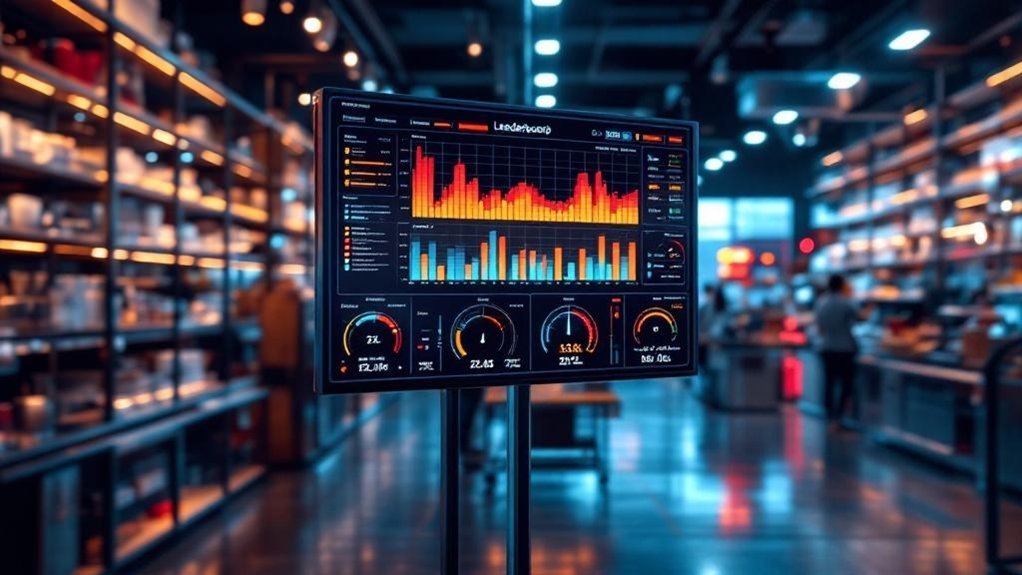
You’ll get a single, data-driven view that pairs a real-time capacity utilization heatmap with a ranked leaderboard so you can spot hotspots, bottlenecks, and underused cells at a glance. It combines OEE and labor-utilization metrics, uses color tiers for fast triage, and scores teams/workstations for fair, actionable comparisons. With normalized, validated feeds from ERP and time-tracking, you can reallocate work, coach performance, and track improvements against targets. Keep going to see how to implement it.
Key Takeaways
- Combine a time-vs-team heatmap and a ranked leaderboard to visualize utilization and identify top/bottom performers instantly.
- Use OEE and Labor Utilization Rate (LUR) normalized across teams as the primary metrics for heatmap coloring and leaderboard scoring.
- Pull consistent data from ERP, time-tracking, and production systems with automated validation and aligned aggregation cadence.
- Define color thresholds (green/yellow/red), deterministic cell mapping, and sortable rankings to drive actionable workload rebalancing.
- Monitor leaderboard engagement, prevent gaming, and run regular reviews with playbooks for over- and underutilization responses.
Why Combine a Heatmap With a Leaderboard for Shop Capacity

When you pair a capacity heatmap with a leaderboard, you get a single, data-driven view that shows not only where resources are stretched or idle but who’s using them most effectively; the heatmap flags problem areas and the leaderboard ranks teams or individuals, enabling fast, strategic decisions about redistributing work, targeting coaching, or reallocating shifts to relieve bottlenecks. You’ll see over- and underutilized zones at a glance while performance rankings spotlight operators driving throughput. That duality turns heat mapping into actionable intelligence: you can prioritize resource allocation to high-risk cells and reward or replicate practices from top performers. The combined feed reduces guesswork, shortens response time to capacity gaps, and aligns operational decisions with measurable employee impact.
Key Metrics to Measure Shop Floor Utilization
You should track Overall Equipment Effectiveness (OEE) to quantify availability, performance, and quality on the shop floor and spot where output falls short of potential. Pair OEE with labor utilization rate to see how workforce allocation and productivity affect capacity. Together these metrics, shown on a heatmap and real-time dashboard, let you pinpoint bottlenecks and prioritize targeted improvements.
Overall Equipment Effectiveness (OEE)
Overall Equipment Effectiveness (OEE) gives you a single, data-driven score that captures availability, performance, and quality so you can quantify how effectively equipment is being used; by multiplying those three factors you get a percentage where 100% means perfect production, world-class is roughly 85–90%, and typical shops sit around 60–70%, highlighting clear opportunity areas when OEE falls short of benchmarks. You’ll use overall equipment effectiveness as a concise KPI to prioritize actions, compare lines, and track improvements over time. Pairing OEE with business capability heat maps and capacity utilization visuals makes problem spots obvious, so you can target downtime, speed losses, and quality defects. Focus on measurement consistency, root-cause analysis, and sustained countermeasures.
- Measure availability, performance, quality consistently
- Benchmark against 85–90% world-class
- Link OEE to heat maps for targeted fixes
- Prioritize high-impact equipment first
- Track trendlines to validate improvements
Labor Utilization Rate
Labor utilization rate (LUR) measures the share of actual labor hours worked against total available hours, giving you a concise, quantifiable view of workforce efficiency on the shop floor. You’ll target an 85–90% LUR as ideal—high enough to maximize output but low enough to allow breaks and flexibility. Track LUR trends to adjust staffing and schedules, and combine LUR with output-per-hour and absenteeism for richer insight. Visualize LUR with heatmaps to spot hot and cold zones, enabling focused management interventions. Use the leaderboard to reward teams in high-utilization cells and redeploy resources from low-utilization areas. Precise, regular measurement drives continuous improvement and aligns labor capacity with production demand.
| Metric | Purpose |
|---|---|
| LUR | Efficiency |
| Heatmap | Visualization |
| Leaderboard | Incentives |
| Management | Actions |
Designing an Effective Capacity Utilization Heatmap
When you design the heatmap, define axes precisely — time intervals on one axis and teams or work cells on the other — so each cell maps to a clear utilization metric. Set color gradients and numeric thresholds (green/yellow/red) based on actionable capacity bands tied to your SLAs or staffing models. Keep role responsibilities and data input rules consistent so the visual thresholds reliably trigger corrective actions.
Clear Axis Definitions
Clear, consistent axis definitions are essential for making a capacity utilization heatmap actionable: use the X-axis for time intervals (days, weeks, months) and the Y-axis for departments, teams, or resource categories so each cell unambiguously maps a resource to a time period and shows utilization via a color gradient—darker hues for higher usage—letting you quickly spot over- or underutilization and track trends. You’ll get a clear view and a stronger visual representation that supports data-driven decision-making. Label axes precisely, include units and period granularity, and align aggregation with operational cadence. Pairing the heatmap with a leaderboard highlights top and lagging performers, making insights directly operational.
- Use explicit, consistent labels
- State time granularity clearly
- Define resource categories upfront
- Guarantee cell mapping is deterministic
- Sync aggregation with reporting cadence
Color and Thresholding
After you’ve locked down axis definitions and labeling, color and thresholding become the next levers for turning raw utilization numbers into rapid, actionable insight. You’ll use color gradients—typically green through yellow to red—to map utilization bands so hotspots jump out. Define thresholding criteria up front (for example 0–70% green, 71–85% yellow, >85% red) and document rationale tied to service-level targets. Make legends and labels conspicuous so stakeholders interpret colors consistently and act on deviations. Update the heatmap frequently with real-time data to reveal trends and trigger interventions. Pair the heatmap with a leaderboard that ranks teams by utilization to drive accountability and optimize capacity. The goal is a visually intuitive, data-driven display that prompts fast, strategic decisions.
Building the Leaderboard: Ranking Workstations and Teams
Because accurate, real-time ranking turns raw capacity numbers into actionable priorities, your leaderboard should score each workstation and team by percent-utilized of available capacity and display those scores with color-coded tiers so you can instantly spot top performers and trouble spots. You’ll measure capacity utilization per workstation, aggregate team capabilities, and present performance as a single normalized score. Keep rankings simple, sortable, and updated in real time so managers can reallocate resources or coach teams immediately. Use color bands (green/yellow/red) to highlight status and promote healthy competition without penalizing collaboration. The leaderboard complements the heatmap by converting spatial insights into prioritized actions.
Score workstations and teams by percent-utilized capacity, normalize into color-coded tiers, and update in real time for prioritized action
- Normalize scores by percent-utilized of available capacity
- Aggregate team output alongside individual stations
- Use color-coded tiers for instant readability
- Enable sorting and filtering for targeted action
- Update in real time for immediate decision-making
Data Sources, Frequency, and Quality Considerations

When you build a reliable shop capacity heatmap, the choice and cadence of data sources matter as much as the visualization itself: pull workforce hours and project assignments from ERP and project-management systems, supplement with time-tracking and ticketing feeds, and reconcile those streams regularly so the map reflects true available capacity. You should define a data sources catalog and integration plan so each feed maps to consistent resource and task identifiers. Set frequency based on decision needs — real-time for operational shifts, daily or weekly for planning — and document latency expectations. Implement automated validation and periodic audits to enforce quality considerations: accuracy, completeness, and consistency. Finally, normalize metrics across systems so the heatmap and leaderboard report a single, trustworthy measure of utilization.
Interpreting Patterns and Identifying Bottlenecks
Although a heatmap gives you an immediate visual of red (overutilized) and green (underutilized) areas, its real value is in the patterns — recurring hotspots, cross-team choke points, and shifting load over time — that reveal where workflows stall and capacity is leaking. You’ll use capacity utilization trends and leaderboard rankings to identify bottlenecks and quantify impact: who’s consistently maxed, which roles drive downstream delays, and where resource allocation skews performance. Historical trends let you forecast pressure points before they crystallize. Continuous monitoring turns snapshots into signals so you can prioritize interventions strategically.
- Correlate red zones with task queues and wait times
- Use leaderboard outliers to flag workload imbalance
- Track role-level trends week-over-week
- Map cross-team handoffs for choke points
- Quantify lost throughput per hotspot
Actionable Responses: Balancing Load and Improving Throughput

If you map heatmap hotspots to task queues and leaderboard outliers, you’ll get the precise signals needed to rebalance work: shift tasks from consistently red cells to underused teams, adjust staffing or hours for recurring peaks, and reroute handoffs that create cross-team delays. Use the heatmap to quantify capacity utilization per team, then set targets on the leaderboard to drive improvements in throughput without overloading high performers. Prioritize interventions where utilization deviations correlate with throughput loss; redeploy staff or automate microtasks to recover cycle time. Track changes on rolling dashboards so you can validate operational efficiency gains and refine resource allocation rules. Make adjustments iterative and metric-led to sustain productivity and reduce bottlenecks.
Implementing and Scaling the Heatmap + Leaderboard System
You’ve used the heatmap and leaderboard to pinpoint bottlenecks and reallocate work; now scale that capability so it becomes an operational routine rather than an ad-hoc fix. Embed real-time data tracking into your systems so the heatmap reflects current resource allocation and the leaderboard updates continuously. Standardize color-coded thresholds (red/yellow/green) and define response playbooks tied to each band. Schedule regular reviews to spot trends, adjust staffing, and prioritize projects based on utilization signals. Track engagement metrics on the leaderboard to guarantee accountability without incentivizing gaming.
- Integrate real-time data tracking with existing dashboards
- Define color thresholds and automated alerts
- Create playbooks for over/underutilization
- Run weekly capacity review meetings
- Monitor leaderboard engagement and fairness
Frequently Asked Questions
Can Chatgpt Create a Heatmap?
You can’t directly generate graphical heatmaps here, but you can get heatmap creation techniques, recommendations for data visualization tools, and guidance on interactive mapping solutions so you’ll prepare data and build visuals in external software.
What Is a Capability Heatmap?
Sure — a capability heatmap’s a neat chaos: you’ll see a visual grid translating capability assessment into color, blending performance metrics with visualization techniques so you can strategically spot gaps, prioritize investments, and track improvement.
What Is a Heat Map in Retail?
A heat map in retail visually shows customer behavior across your store, using retail analytics to reveal traffic, dwell time and conversion hotspots so you can drive sales optimization, prioritize merchandising, and allocate staff strategically.
How Many Dimensions Does a Typical Heatmap Represent?
You’re usually looking at two dimensions, though it can feel like a million in complexity. You’ll use data visualization techniques and dimensional analysis to extend heatmap applications with size, color or time, keeping insights strategic and concise.
Conclusion
You’ll gain clarity and control by pairing a capacity heatmap with a leaderboard: the heatmap spots real-time strain, the leaderboard forces accountability. Use utilization, cycle time, and downtime metrics to drive decisions, and refresh data frequently to keep signals valid. Spot patterns, rebalance load, and target interventions where they’ll raise throughput most. Like a compass guiding a ship, this combo turns noisy metrics into precise action — measurable, repeatable, and strategically aligned.